QI interrupts the (first words) of this Feather with a not non sequitur alert. What do you get when you fuse successful songwriters Mike Chapman and Holly Knight, Welsh singer Bonnie Tyler (of “Total Eclipse of the Heart” fame), the Queen of Rock ‘n’ Roll Tina Turner and NBC’s Saturday Night Live (SNL)? Chapman and Knight wrote Tyler’s 1998 release “The Best.” The next year, Turner recorded a cover version, which became “Simply the Best” that exploded into an international hit. And finally, in 2015, on the occasion of SNL’s 40th Anniversary Special, alums Andy Samberg and Adam Sandler adapted the song in a digital short to pay tribute to cast members breaking character. One viewing of “That’s When You Break” and you burst out laughing at the multitude of times SNL players busted up mid-sketch (many hat tips to Jimmy Fallon).
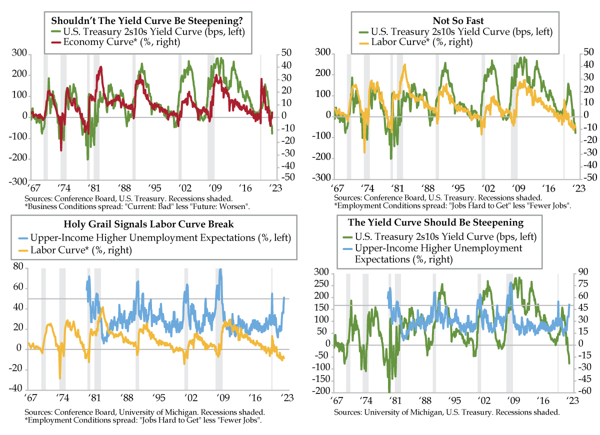
Channeling our best Samberg and Sandler, QI’s own version is an ode to the yield curve. The most recognizable U.S. Treasury spread between the 2-year and 10-year yields has plumbed close to 80 basis points under, depths that harken back to the prologue before the recessions in the 1970s and early 1980s (green line). It’s well documented that Fed policy became progressively restrictive as that inflation decade unfolded. The yield curve in turn reflected the uber-tightness, at one point testing the -200-basis point mark in 1980 (Thank You, Paul Volcker).
We’re not there yet and may never again be given the message emanating from different curves we introduced some time ago extracting from the Conference Board’s consumer confidence survey. The “economy curve” pits negative responses on current and future business conditions against each other. The “labor curve” does the same thing but substitutes in present and expected employment conditions.
While leads and lags have varied, the economy and yield curves have shadowed one another across decades. Inversions in the two indicate recessions and flag impending steepening. In November, the economy curve did just that and steepened to a level of 4.0 (red line), as more households reported bad current business conditions over those anticipating a worsening in the next six months. The breaking of the economy curve from June’s low point of -6.9 points fits with past recessionary swings. The yield curve, however, has not broken character and continues to reflect expectations of tighter Fed policy to combat too-high inflation.
Notably, what’s also not broken is the labor curve — the difference between Jobs Hard to Get (an unemployment rate proxy) and Fewer Jobs (a gauge of future layoffs) – which enters gray area into the dialogue (yellow line). As the labor market tightened after last year’s vaccine and stimulus-induced reopening, the labor curve inverted for 19 straight months beginning in May 2021.
It’s only in the current month of November that evidence of higher layoffs from multiple sources has surfaced. Risks from the anecdata of dailyjobcuts.com and Challenger, Gray & Christmas are the tip of the proverbial iceberg. Add to these rising continuing jobless claims, broadening state jobless claims breadth, and a not-seasonally-adjusted uptrend in nationwide initial claims. All point to an unemployment rate picture on the precipice of worsening.
Since 1967, Jobs Hard to Get has an excellent .88 correlation with the unemployment rate. Once households wise up to the job market following housing into recession, the labor curve should break and steepen, following the economy curve. While not all households have been operating with
“insider information” as to the path of joblessness, those at the top of income stack have long since been apprised of what’s to come. Upper-income higher unemployment expectations via the University of Michigan consumer survey rose to 51% in November (light blue line), the first breach north of 50% since the initial shock of the pandemic hit. More notably, in the series back to October 1979, crossing this threshold has preceded every recession since. Critically, this gauge has always continued to rise afterwards. Expect a Conference Board labor market metric echo in the months ahead.
As for the yield curve, deterioration in upper-income higher unemployment expectations has correctly foreshadowed a steeper path for the 2s/10s curve in every recession since 1980. Outlier readings of 51% and higher have coincided with a positive 2s/10s spread 82% of the time. The 18% tail coincided with the inversions during the 1979-80 period and one episode in 1982. The tails, however, eventually came back to the center of the distribution as steepening followed the deep inversions recorded in October 1979, March 1980, and March 1982. We sense that November 2022 is about to be added to that tail list.
November’s fundamental weakening in labor statistics collided with record fear of “Make My Day” Jay Powell. Though we fully expect tough talk today from the chair of the Federal Reserve, risks increasingly point to weakening fundamentals trumping the hawks’ rhetoric. We should emphasize here that a dampening of the pace of rate hikes will not herald an easing cycle. Nonetheless, there’s no denying the depth of the crowd in today’s one-way trade. According to the Commitments of Traders report, net short speculative futures and options positions in the 2-year Treasury were at an all-time high in the week ended November 15th. It will take the whites of the eyes of recession to convince investors. The best expression to sell that idea would be through an unemployment shock. All other job market indicators corroborate the warning to get ready. The labor cycle is about to break.